
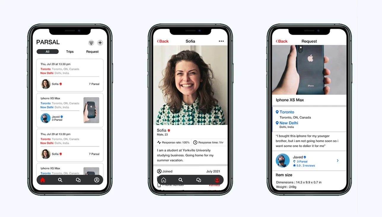
Parsal
PARSAL is an app that lets the user parcel their stuff from one place to another place, but the twist is that the people who deliver the stuff are the users as well. This means if someone is going to Delhi from Toronto and you want to send something to Delhi you can ask him through the app if can he deliver your stuff to Delhi and the algorithm of the app will tell you the price of the delivery. The price is definitely less than FedEx and DHL because that’s the reason for making this app.
Project overview
Challenge
Build a platform so that a user can send the stuff nationally and internationally with minimal charges.
Role
UI/UX Designer
time
4 weeks
task
Design a shipping app where users can help each other with sending and bringing stuff at minimal charges.
tools
Figma, Photoshop, Illustrator
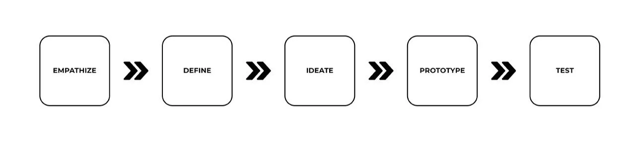
My Process
empathy
research
As I am very much familiar with the shipping companies. But I wanted to do research to gain a better understanding of the market. So I conducted interviews and learned about the experiences people had when they send their stuff nationally and internationally.
Through my research, I wanted to:
Understand the PARSAL’s target market.
Identify PARSAL competitors and evaluate their strengths and weaknesses.
Understand the experiences people have while shipping their stuff.
Find the goals, needs, motivations, and frustrations of PARSAL’s users.
market research
To learn more about the market trends of the shipping industry, I started my research from google. With the help of the google I was able to find out what was going on in the shipping market. I got my doubts cleared and the information I gathered gave me the better understanding of the industry, which will help me to move forward. Here are some of the key insights that I discovered:
CONSUMER TRENDS
US companies spent $1.49 trillion in shipping in the year 2017.
UPS shipped 24.7 million packages and FedEx shipped 18 million packages each day in 2019.
40% of the people are more likely to buy from a company who have an easy return policy.
CONSUMER FEARS
Due to the long line of procedures and poor handling of a package most packages get damaged and destroyed.
People are not comfortable shipping their packages internationally because of the possibility of losing their stuff.
Custom duty is a real nightmare as different countries have different prices and regulations, and inspection is a real headache.
The most important fear people have while shipping is price. Because it is very expensive.
CUSTOMER EXPERIENCE
90% of people in the US cite customer service as a major driving force when making a decision.
59% of consumers will never do business with a company after two or three negative experiences.
96% of all customers say customer experience is an important part of their loyalty to a brand.
47% of customers say the delivery option they want is sometimes, rarely, or never available to them.
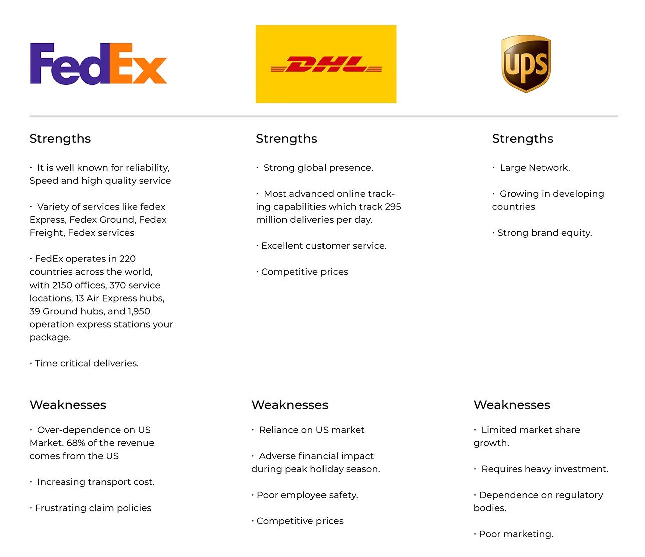
Competitive Analysis
It all begins with an idea. Maybe you want to launch a business. Maybe you want to turn a hobby into something more. Or maybe you have a creative project to share with the world. Whatever it is, the way you tell your story online can make all the difference.
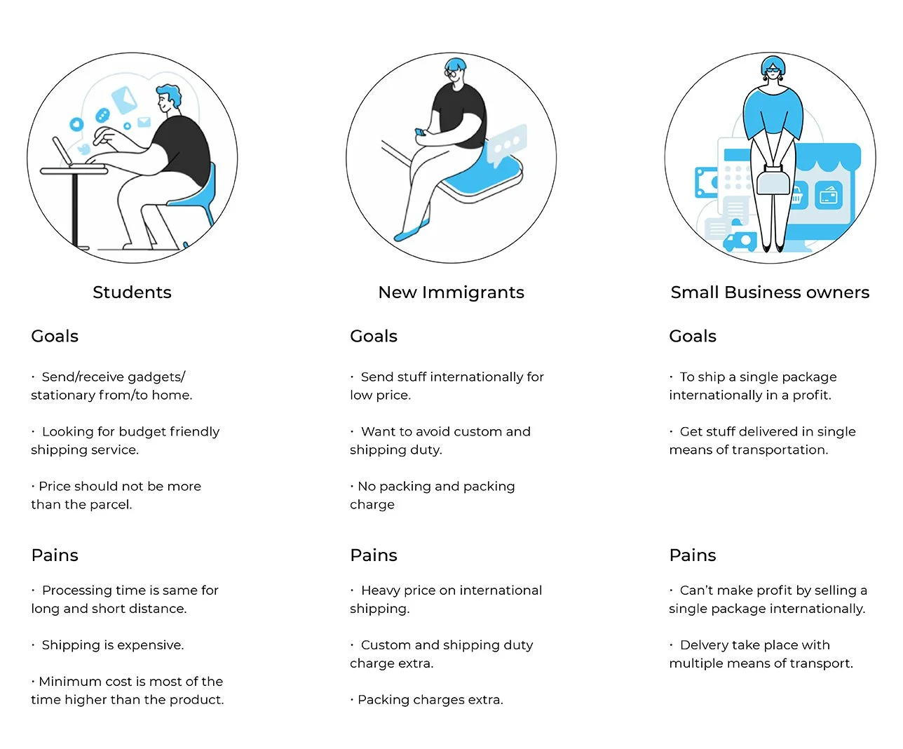
Provisional Personas
To start getting an idea of who PARSAL’s users are, I used everything that I have learned so far from my secondary research to create provisional personas. This helped me to determine the criteria for participants I would recruit for my user interviews and start understanding what their needs might be based on their gains and pains.
User Interviews
To learn about the experiences people have while shipping, I interviewed 5 people from different areas (fitting within the criteria of provisional personals). I asked open-ended questions from PARSAL’s users so that I could learn more about them and use that knowledge to build the same platform that user want.
"I feel like the shipping services we have right now they charge a high price and even more for a luxury shipping. And in some countries customer has to pay extra money after the custom fees. Then protection fees incase you wanna protect your package. I look for something cheaper and safer without any extra charges." - Javed
Empathy Map
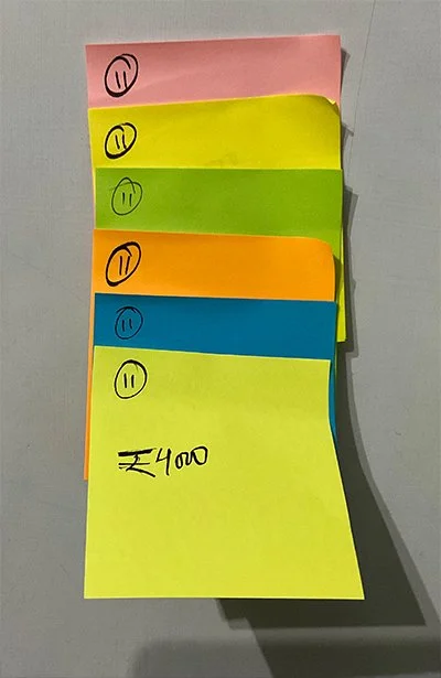
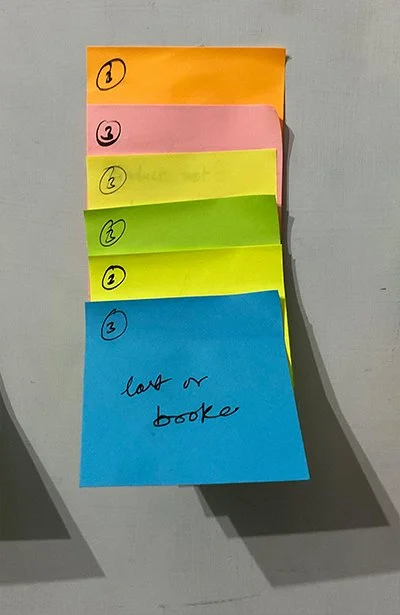
All the information i gathered from the interviews I categorise them and made a empathy map on the basis of the common pattern i find on the interviews. Due to which i was able to uncover some key insights which help me to understand who PARSAL customer really are and what they need.
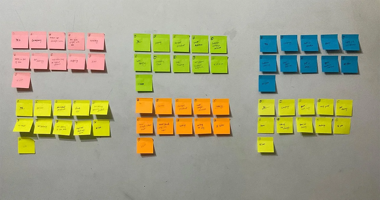
From the major patterns that I identified from the empathy map, I discovered the following key insights which helped me to understand what the user’s needs are:
-
price
Everyone shared that price is the second most important factor when using a shipping service.
-
safety
Everyone shared that safety is their first priority. They don’t there stuff to be damaged, stolen, or replaced by the fake one.
-
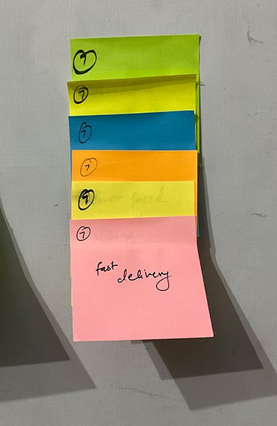
fast delivery
Most of them want the deliveries to be faster at a cheaper price.
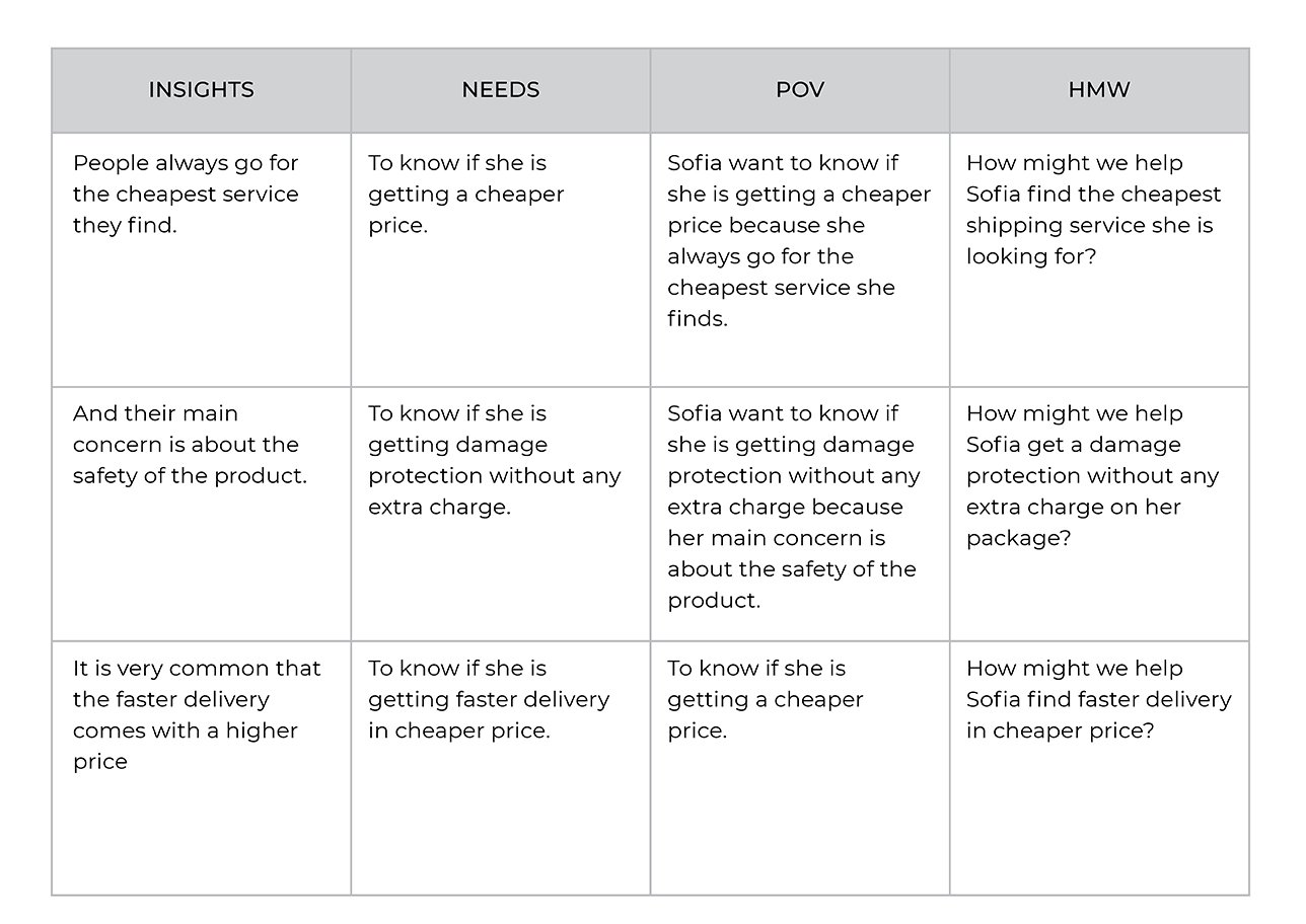
insights
And their main concern is about the safety of the product.
It is very common that the faster delivery comes with a higher price.
People always go for the cheapest service they find.
needs
To know if she is getting damage protection without any extra charge.
To know if she is getting faster delivery at a cheaper price.
To know if she is getting a cheaper price.
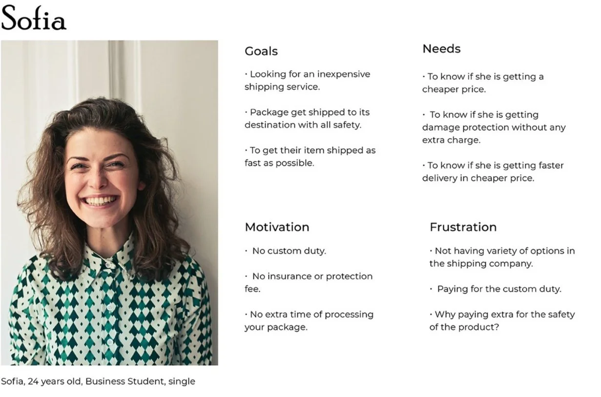
User Persona
To make sure that my decisions moving forward in the process are user-centered, I wanted to have a clear understanding of who PARSAL’s users are. Using what I learned from patterns from my empathy map, I created a user persona to represent who I will be designing for - Meet Sofia!
DEFINE & IDEATE
User Persona
To make sure that my decisions moving forward in the process are user-centered, I wanted to have a clear understanding of who PARSAL’s users are. Using what I learned from patterns from my empathy map, I created a user persona to represent who I will be designing for - Meet Sofia!
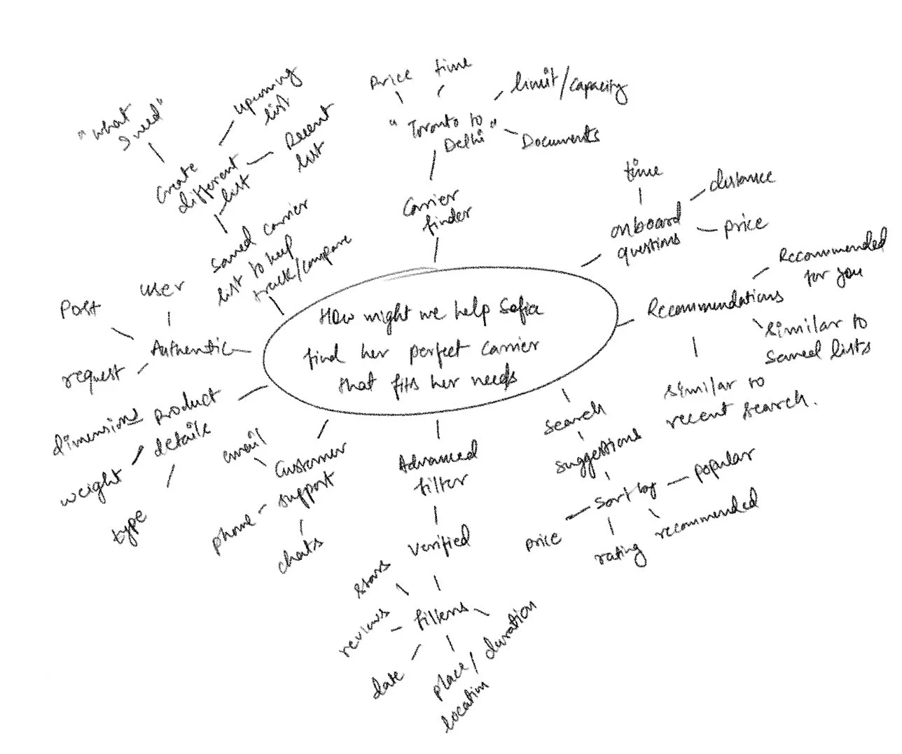
Brainstorming
Taking the HMW questions, I started my brainstorming process to come up with solutions for each of these problems. I decided to use mind mapping so that I could quickly generate as many ideas as I could.
How might we help Sofia find the perfect carrier that fits her needs?
Project Goals
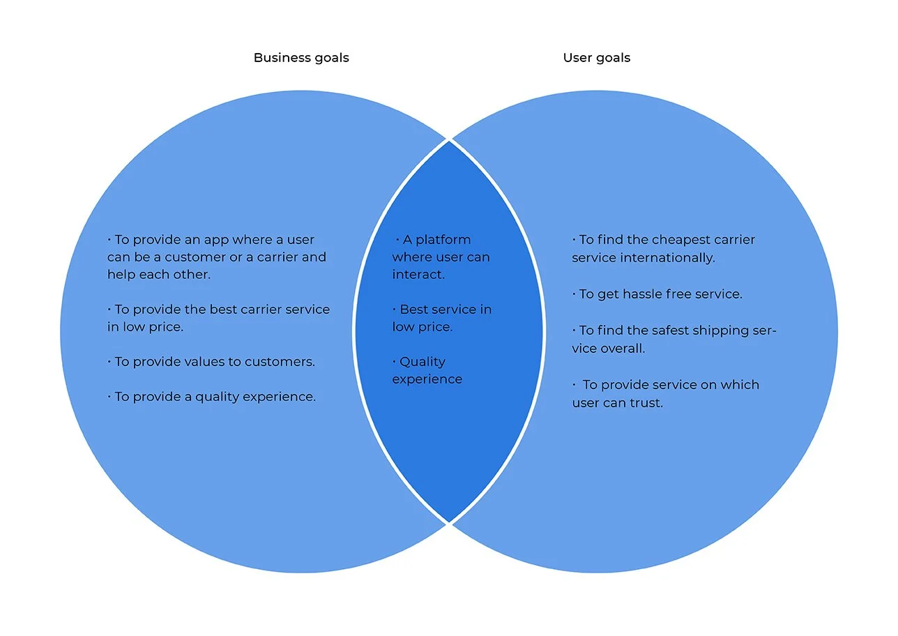
After brainstorming, I generated a lot of different ideas for these problems. At this point, I started laying out a strategy to help determine what goals I was trying to meet and to help me determine which solutions I needed to prioritize.
First, I started by defining the project goals to get a clear understanding of what we’re trying to achieve and where the business and user goals align
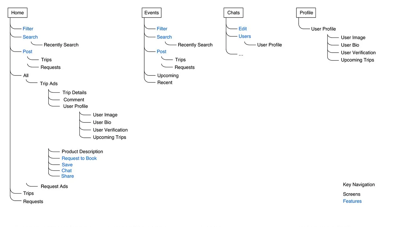
Application Map
I then worked on the architecture of the application and where these features would fit into it, I created an application map to organize the screens in a way that would be logical and intuitive for our user.
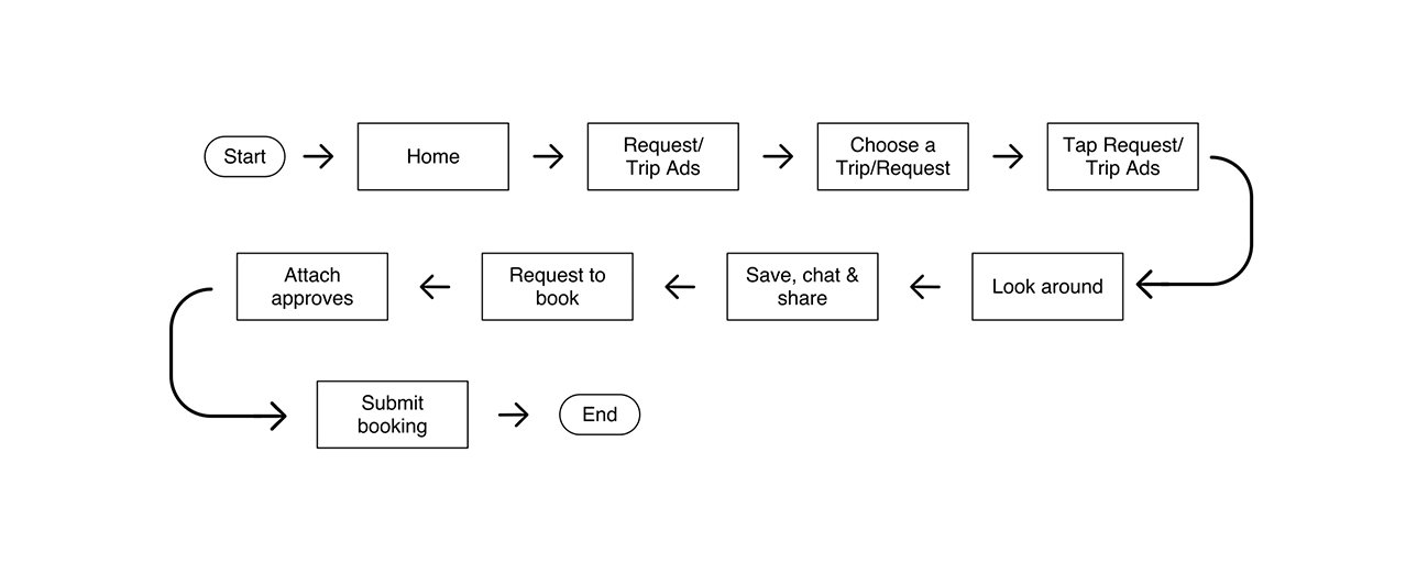
Task Flow
I had a clear idea of the architecture of the app, however, I wanted to continue to better understand how Sofia would be interacting with the key screens and features in the app.
I first started by identifying what key tasks the user would be trying to complete when using Parsal based on the user’s goals. Then, I fleshed out the specifications for the key screens we would need to design to help our users complete each of those tasks. Finally, using this information, I started my process of understanding our user’s interaction with the app with task flows. These task flows helped me to see how our users would be completing these key tasks - what screens they would be interacting with and what actions they would be taking in a linear flow.
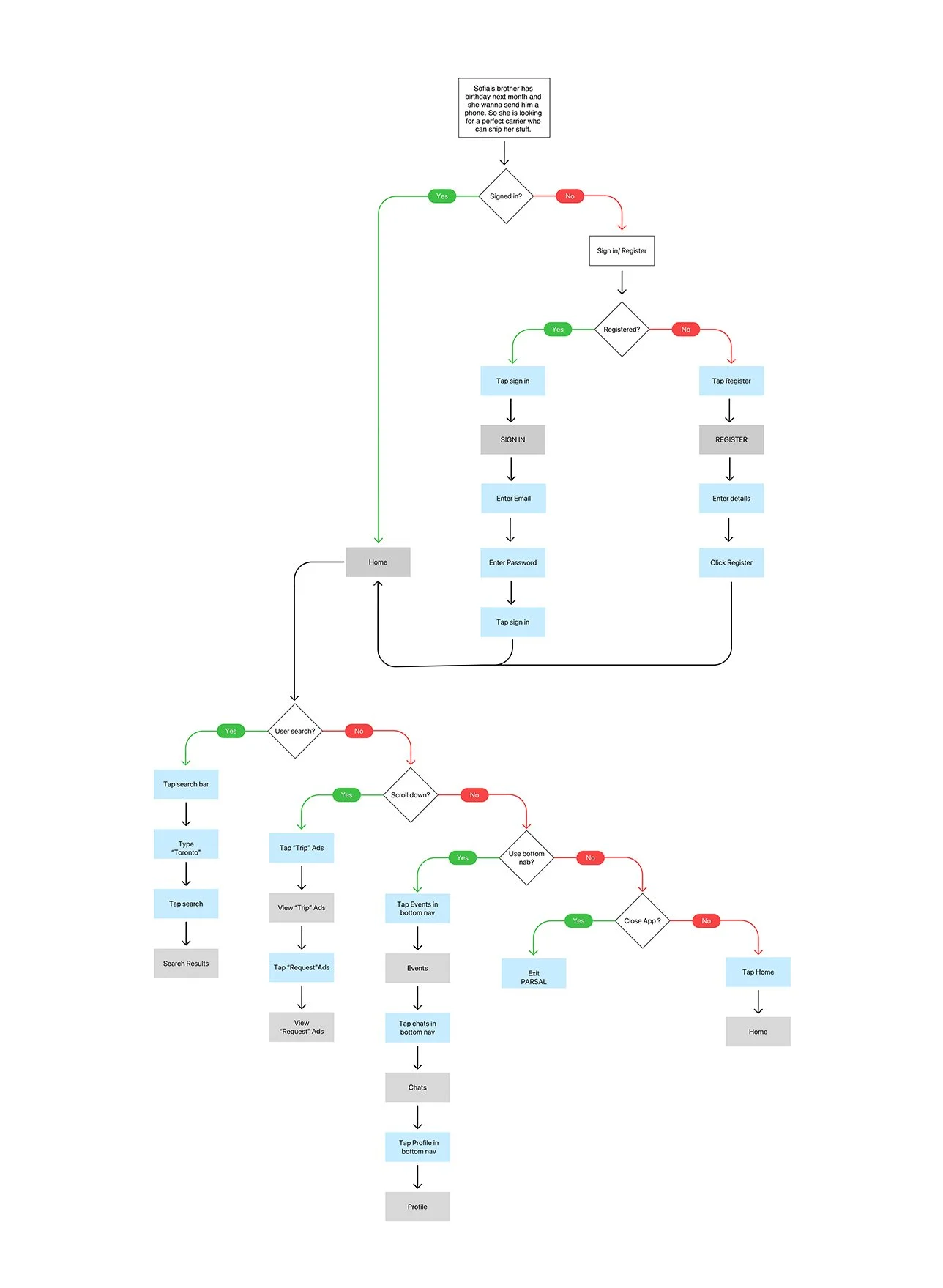
User Flow
Now I wanted to dive even deeper and get a better understanding of the overall journey Sofia would be taking throughout the app from start to finish. I wanted to better empathize with the scenario she may be in, the different decisions she would be making, and also the different paths she might take to complete the key tasks I identified. To do this, I created a user flow to step into Sofia’s shoes.
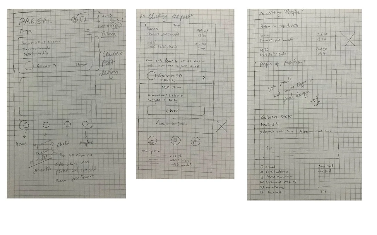
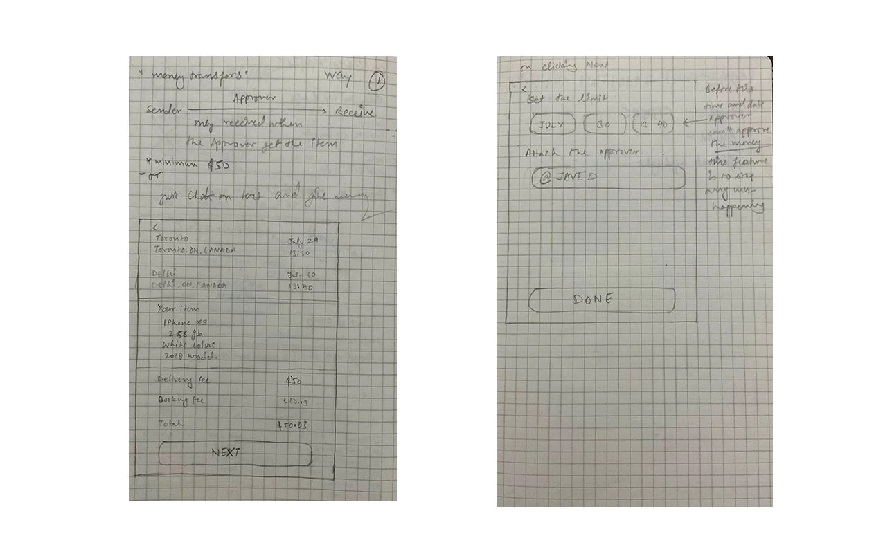
Lofi Wireframe Sketches
Using my understanding of the user, our goals, the architecture, and the user’s interaction with the app, I worked on making informed decisions on how to design Parsal’s screens by sketching low-fidelity wireframes.
PROTOTYPE & TESTING
Sketces to Prototype
Now that I had sketched out my ideas, I wanted to test the decisions I made and make sure that the structure and flow of the app is intuitive for our users. Before working on the visual design, I wanted to first make sure that the design was functional. In order to do this, I decided to create a mid-fidelity prototype which would help me quickly test the design on real users and make any priority revisions before integrating the branding and visual design.
Mid-Fidelity Wireframes
To create my prototype, I first started by creating mid-fidelity wireframes on Figma of the key screens the users would be interacting with
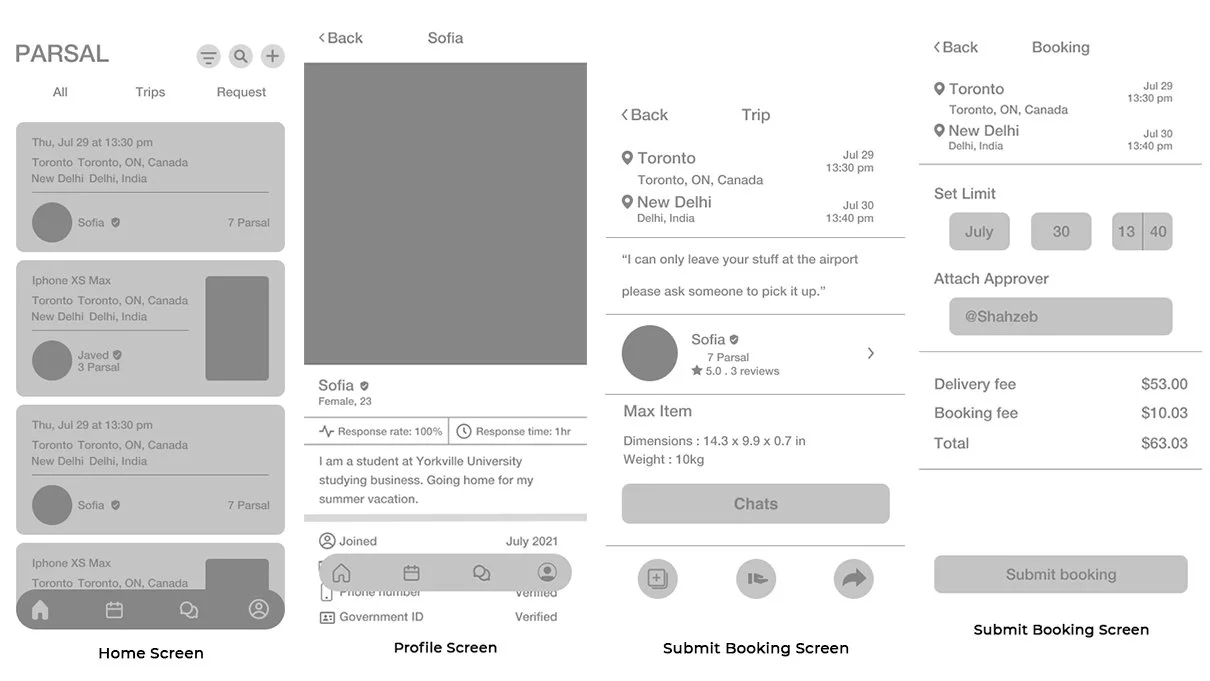
Mid-Fidelity Prototype
Taking the wireframes, I then worked on creating a mid-fidelity, limited functionality prototype, using Figma, to use for usability testing.
Usabilty Testing
For usability testing, I conducted In-person, moderated Think Aloud testing. The users were asked to share what they were doing, thinking, and feeling while interacting with the prototype and Mid Fidelity Wireframes and trying to complete the tasks given to them. I tested around the key tasks I identified earlier in the process, asking the user to browse generally, choose a trip/request, and then submit the booking.
OVERVIEW
Method: In-person, moderated usability testing (Think Aloud)
Participants: 5
Age range: Millennials
Average Time: 4.4 minutes
Task Completion Rate: 95%
Error-Free Rate: 99.4%
Overall, the testing showed positive results, but there were distinct areas in which users did face difficulties.
Affinity Map
To synthesize my findings from testing, I took all my notes and observations and created an affinity map. This helped me to better digest the different patterns observed while testing and pin point where revisions need to be prioritized to improve the usability of the design.
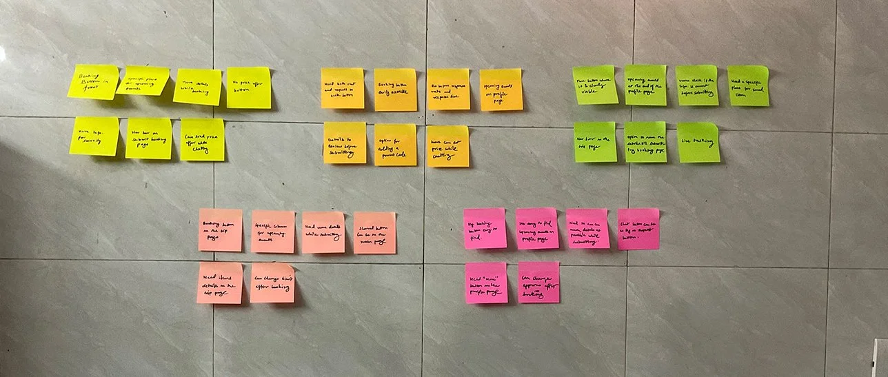
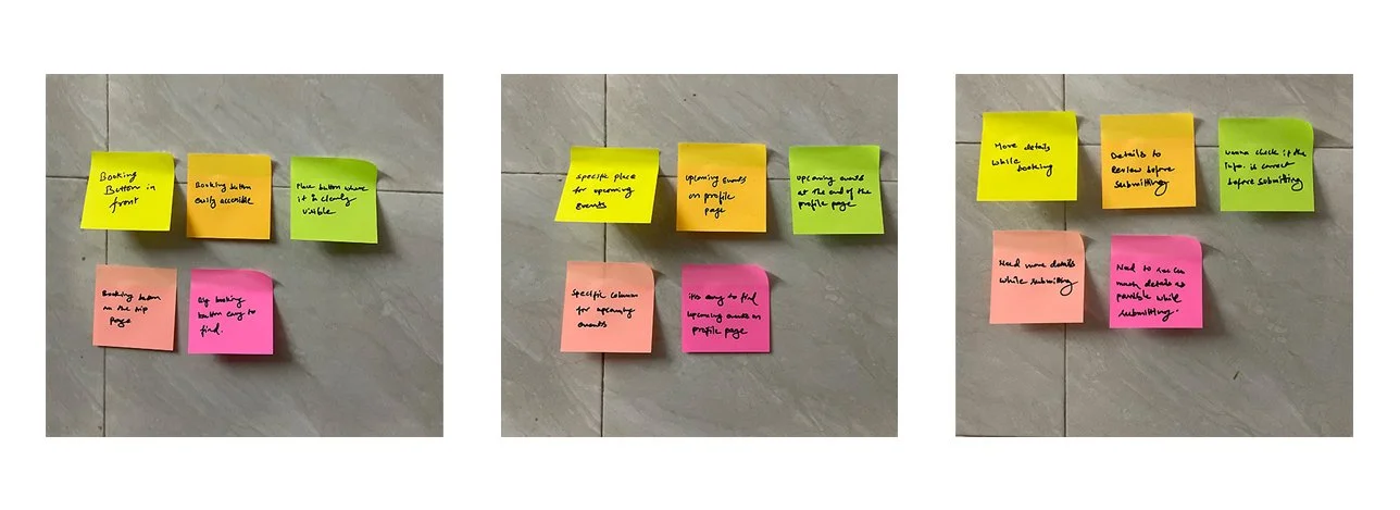
Based on the prominent patterns observed related to the users’ pain points, I was able to uncover insights which helped lead to specific design recommendations:
PAIN POINTS
5/5 users didn’t find the “Request to book” button. Users expressed that it would be helpful if they could easily access the Button. (5/5 users successfully completed the task when instructed)
4/5 users faced difficulty while finding the trip/request they posted. They suggested to have a section for Upcoming Events.
4/5 users wanted to have more information just for the sake of review while submitting the booking.
INSIGHTS
Where users can see the trips/requests they have posted.
Users want to review more information before submitting the booking.
People want to have a booking bottom which is easily accessible.
RECOMMENDATIONS
Make an upcoming events section for trips/Request at the very end on the profile page.
Add more details on the booking page so that user can review.
Change the chat button to request to book button on the trip page.
Priority Revisions
Taking what I learned from my affinity map, I began to make revisions to my design based on the recommendations identified.
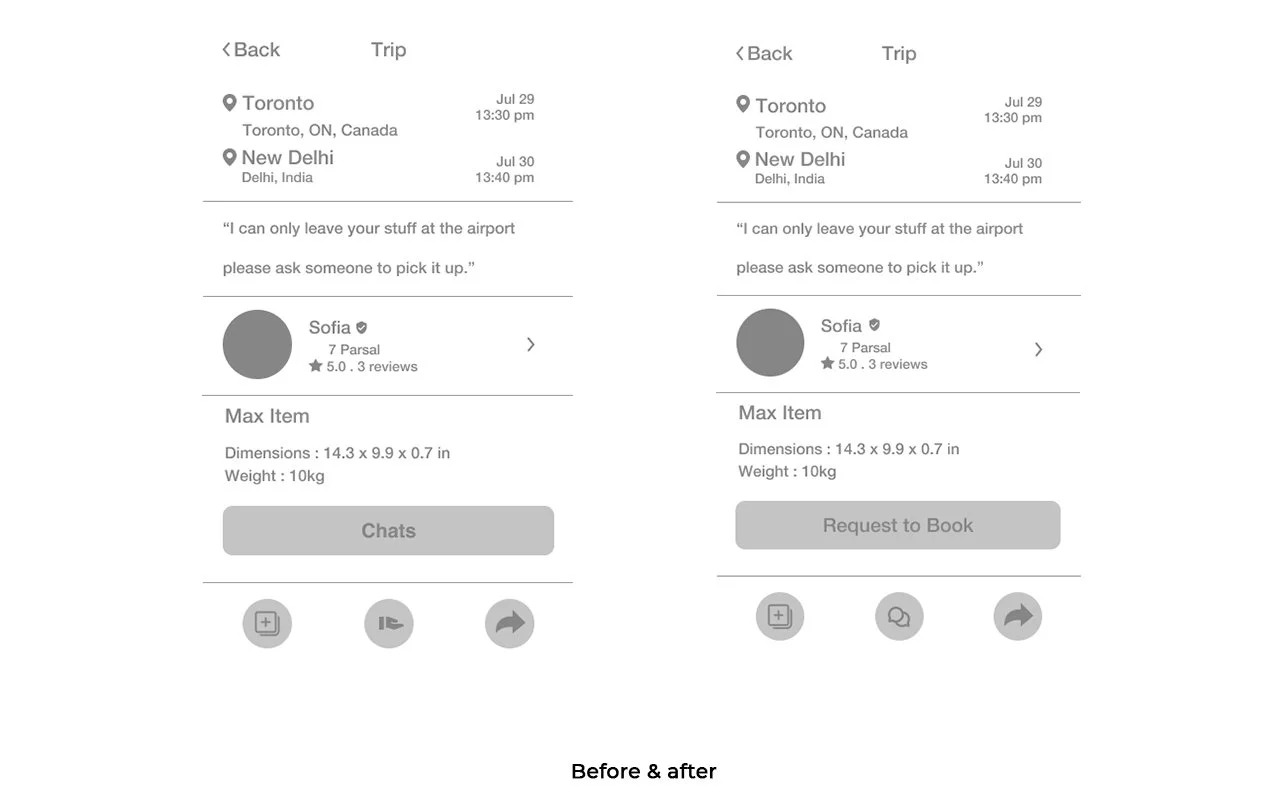
1.Change the chat button to request to book button on the trip page.
People want to have a booking button which is easily accessible and to have that putting the button on the trip page is perfect. These was plan of putting the booking button but i had to do it on users demand. (I was planning to not to put a booking button I thought uses can chat and figure out themselves)
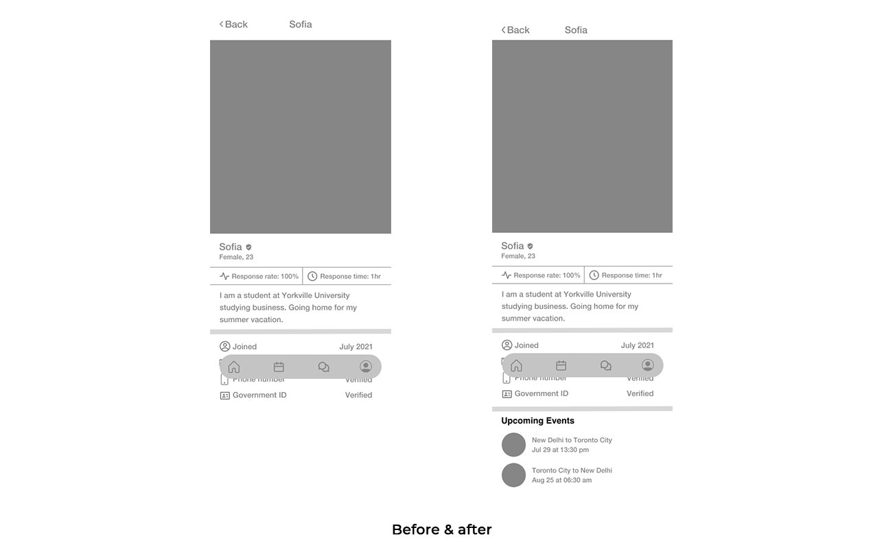
2.Make a upcoming events section for trips/Request at the very end on the profile page.
There is no section where user can see their own listing so i made a section of Upcoming events on the profile page so that user can see their listing. And it also shows the importance of the listings.
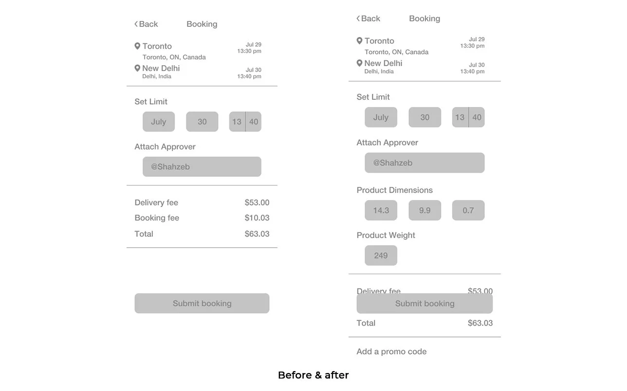
3. Add more details on the booking page so that user can review.
Users wanted to review the details for the final time at the end of the booking before submitting. Which makes it easier to review and spot any mistake before finalising.
UI DESIGN
Branding
After making the revisions to my design to improve its usability, I now wanted to think about how we would convey Parsal’s brand visually. Parsal’s branding reflects the attributes: Cheap, safe and easy and I worked on setting the visual direction of their branding to convey their unique identity
Logo Design
Now that I knew what direction we are headed towards for their branding, I started working on creating a logo that would represent their brand. I started by brainstorming around their key attributes and then quickly sketching out different ideas that came to mind. Afterwards, I narrowed down my options to the one that I felt was the most successful and unique in conveying their brand attributes.
Style Tile
After designing Parsal’s logo, I then started working on finalizing Parsal’s visual identity and created a style tile.
For Parsal’s branding, I focused on creating a balance between Parsal’s cheap, safe, and easy aesthetics while still maintaining their reliability. The rounded shapes in the logo provide a sense of protection and commitment, and the color palette is energetic, but not overpowering.
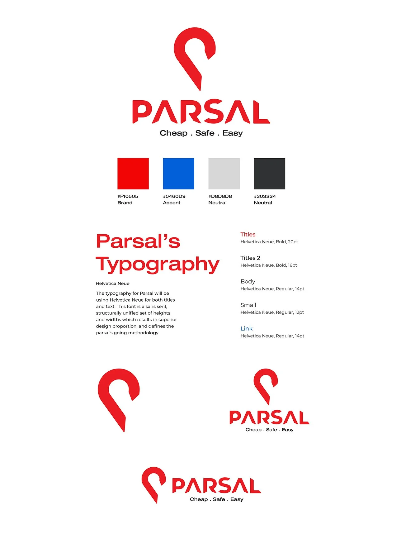
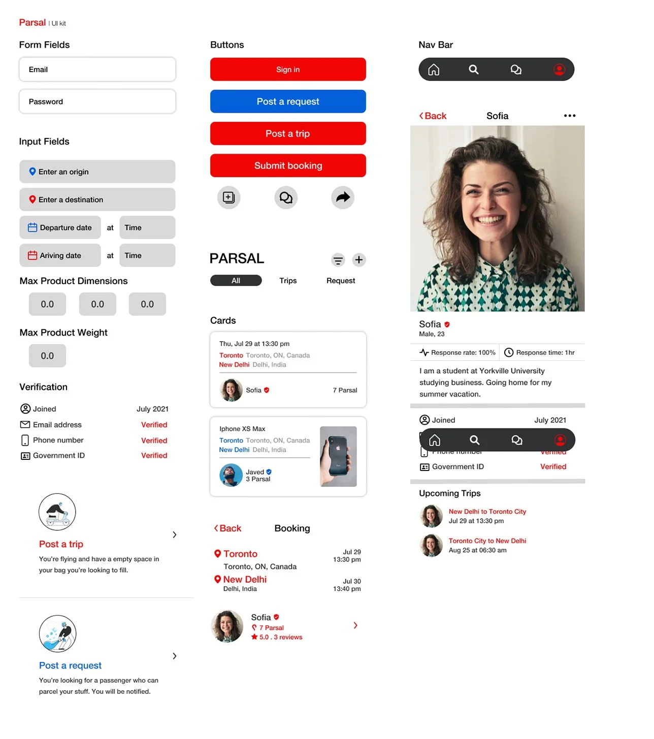
UI Kit
Using the style tile as a guideline, I incorporated Parsal’s branding into the UI elements used for Parsal’s application. To ensure that the design standards remain coherent across future developments or other designers, I created a UI kit to document the elements for reference.
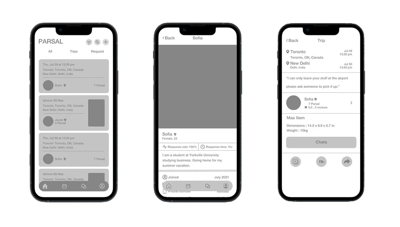
Final Prototype
Taking my revised wireframes, I now worked on creating final, high fidelity wireframes and created a final prototype. With Parsal’s branding defined, I worked on incorporating their identity to craft the visual design of their new application.

Reflection & Next Steps
This is app is very simple to use, it's like browsing through the facebook's market place, but still to keep it user friendly I have to keep on making consistent changes.Both secondary and primary research were key in getting up to speed with the market and being able to empathize with other’s experiences, especially since I haven’t gone through those experiences myself just yet.
Overall, this project was a lot of fun to work on - building an app from start to finish, and deliveries easier than before. it is interesting to fill the market gap with just a piece of code, and want to learn how it going to help people in real life.
RE-TEST
With the new revisions and branding incorporated, I would want to test my design again to ensure the design’s usability
PRODUCT LAUNCH
After the app has been built, we will introduce the new product to the market
HAND-OFF
After validating the design, I would hand off the design to developers or other stakeholders to work on developing the app
ADD FEATURES
After the first version of the app has launched, I would observe how people are using it and work on updating priorities and adding new features to the app.